Pink Stork Baby Drops Packaging
Challenge
For this project we were tasked with redesigning the packaging for Pink Storks Baby Drops product line. The brief for the rebrand was to adopt a fun and playful design, moving away from its previous mom-centric approach. The goal was to make the products more appealing to both babies and toddlers by using colorful, engaging packaging similar to competitors. The design for all products had to remain consistent, with individual products distinguished by unique colors. The rebrand was intended to broaden the product’s target demographic while maintaining a cohesive and attractive brand presentation.
Process
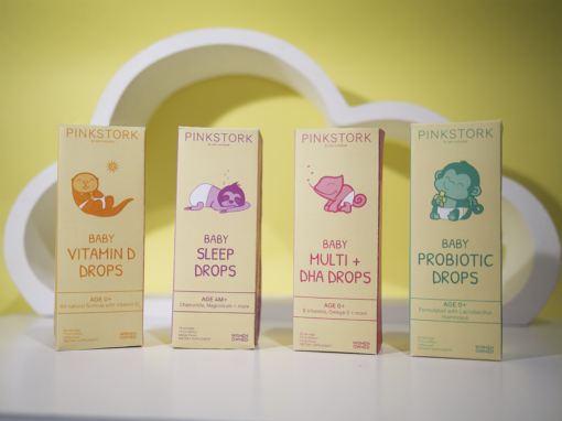
First I picked the shape of packaging. I went with the traditional rectangle. I then worked through my color palette, picking 4 pastel colors and a beige base. Later deciding to do the two different tones on the sides of the box to compliment the color dimension of the illustrations.
The illustrated animals on each package correlate to what the drops do. I chose a chameleon for the multi drops because of their multi colored appearances/ability to change color. I chose the sloth for sleep drops since they are a slow moving sleepy animal. I chose the otter for the vitamin D drops because they are always on their backs sunbathing. I chose the monkey eating a banana because bananas are good for your gut health as are probiotics.


Results
I used a natural base color on my packaging to reflect the natural products that Pink Stork uses in their products and the two-toned pastel color palette to be comforting. The illustrations make the package playful and appealing to children. To contribute to the gentle theme of the packaging I chose a font that looks hand-drawn. All of these component combined give the packing a gentle appearance that attracts both the mothers and their babies.