Corner Sushi Rebrand


Challenge
Process
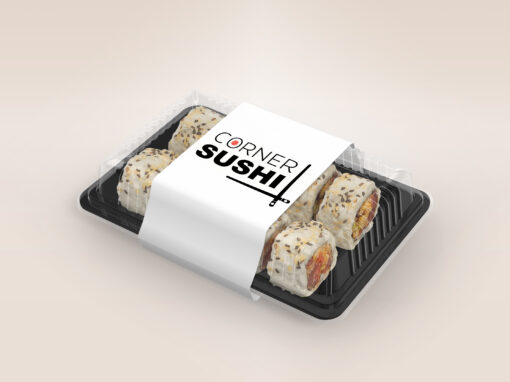
I chose Corner Sushi, a local sushi restaurant, where you know you’ll be taken care of. The current signage is neon blue. The interior has green LED lights and marble walls. Their menu then emphasizes red, purple, and green. These different patterns and colors making the restaurants brand very chaotic.
To solve the disconnect between the fantastic food and service and the non cohesive visual brand image, the rebrand creates a unifed look throughout all the elements of this restaurant. The logo and colors represent traditional Japanese culture. It appears clean, bold and friendly, so that customers know they can trust the little place on the corner to be exceptional.
Branded Media


Branded Media

Interior Design

Exterior Design

Results
The new logo, branded media, and interior and exterior designs make for a clean & cohesive brand that showcases Corner Sushi’s true identity.